
Business banners are made for multiple locations that are meant to attract customer attention. The idea behind any business decision is to promote growth and generate more revenue. The perfect business banner will be cost-effective, will promote customer retention and will be perfect for advertising.
If a business is investing in a banner for the first time we need to understand the semantics that go into it. A graphic designer will be a good help to get the basic pointers but one also needs to approach the creation of a banner from a business perspective. Here are some tips to design an effective banner for your business.
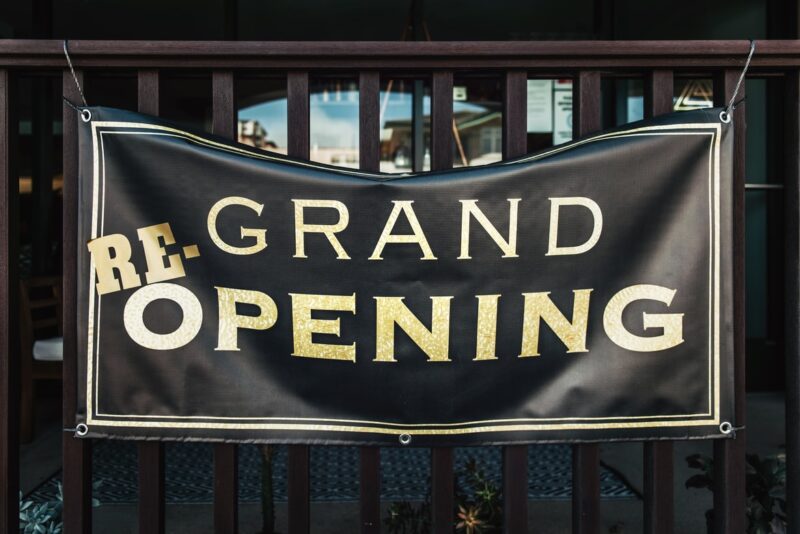
1. The Size and Style Should Match

Are you willing to make a big statement? Do you want to give out information? What is the purpose of your banner? All of these factors should be considered first before deciding on the size and style of the banner. A small or a big size is just as important as the message because one needs to consider how the business is being perceived by anyone who is looking at it. Let us see how size determines the effectiveness of hoarding.
- Small sizes are made for internet gatherings or events with a very limited number of people. Because there are fewer people there is no need to advertise it to a bigger crowd because everyone can just walk and read.
- Medium size is mostly preferred by small businesses who want to advertise but do not want to spend the money on the biggest option available. It gets the message across and is also perfect for a strict budget.
- Large sizes will be landscape and enable the reading from left to right. They can be displayed at public places because the visibility is perfect for large crowds.
- Standing banners are important mode so the message will be displayed from talk to bottom. It will be displayed at a height because of a good size which can be viewed by multiple people at once.
- The roll up style of banners is very useful for any event which will be recurring. No matter the size this type can be easily rolled up and stored to be used again whenever required.
- The double sided style is perfect for greater visibility and perfect advertising. Marketing campaigns can save a lot of money by opting for double sided banners with similar or complementary messages about the same service.
2. Put in Key Information

No matter the size and style of the banner, one should always pay attention to the message being delivered. The surface should not be oversaturated with information and should include just enough to keep the onlooker interested. A call to action link or contact information should be available at the bottom.
In the case of advertising or events, one can also include a QR code to directly register for a product or service. When we talk of key information we mean including the name and type of the service along with the intended message of the banner. Whenever possible, install images into the graphic design.
Images are what attract people and keep their attention. If someone likes the image used they will automatically read the intended message and are more likely to engage with the content. Whether it is the launch of a new service or the inauguration of a new club, images are your best friends. If you want good quality banner stationery uk, make sure to visit reliable sites like https://www.gdpm.co.uk/.
We have already mentioned that contact information should be available but along with it include your brand logo. The message should be strong enough to have the customers associate your brand with the service. If it is an event make sure to include the address for more engagement and install the banners on the way to the location.
3. Only Legible Font
It is very easy to get carried away with the choice of fonts available. But what might work in an email or a document might not be the best idea for a banner. The font should be legible even from a distance which is why clarity is the first priority. All the interested parties should be able to read the message without having to squint or wait longer than necessary to decipher the information.
The engagement with the content is directly related to how legible the message is. Georgia, Karla, Roboto, Lato, Rooney, Quicksand, and Century Gothic the most commonly used fonts for differently sized banners across different businesses. These are just recommendations and you can of course find new fonts to try out. The best approach in choosing a font will be to get inputs from a control group who has not been involved in the project.
4. Go for Symmetry

Asymmetrical designs are often unsitting and can bring you the surprise factor by making people more interested in the message. But most of the time symmetrical designs are what will get the job done. People are very used to symmetry and out of the box designs that symmetry has become underrated.
Go with a subtle yet symmetrical design that displays all the needed information. The best will be to use a stock photo related to the information being presented and strategically place the message. Customization is the best because it allows for creativity. There are different ways in which a banner can be used so taking symmetry as the base, one can easily experiment and create good designs.
The Takeaway
A good banner means high engagement, increasing the customer base, and boosting revenue all at once. Understand the importance of size and style, along with the right message.
Legibility is just as important as attracting attention by using the right images one should be ready to experiment but only to the level of better engagement. Take the help of a control group that can give constructive criticism on how to make better banners.


