
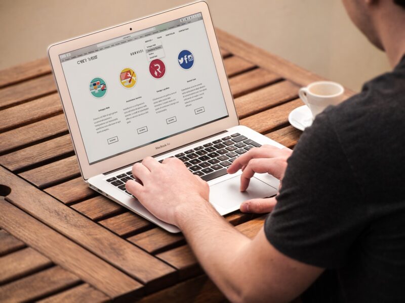
Websites nowadays have become more user-friendly to attract customers. Due to customers’ demand, the websites have progressed and developed so much that they can entertain and offer an excellent comfortable experience.
Seo and PPC agency is an essential aspect in today’s digital marketing world that helps to optimize websites to their full potential.
Tips For Making Websites User Friendly
A website having a user-friendly page gives a professional look to the customers browsing it. Even accessibility needs people can use it without facing any difficulty.
It has dramatically increased the website’s usability so that all visitors can easily access the information needed without putting too much effort. Even placing call-to-action (CTA) buttons at the right spot on websites has made them more interactive. A few tips for making websites user-friendly include,
Pay Attention To Visitors
Ask the visitors about the user-friendly experience of the website and take input from them about how to improve it. These visitors will tell what they like and don’t like about the website.
The companies should positively take their comments and redesign the website that caters to visitors’ suggestions. It will improve the revenue as there will be more footfall.
Website Loading Should Be Fast

The website users expect the websites to load at a break-neck speed within microseconds. If the website loading is slow, the visitors will abandon that site. So the loading speed of the website does matter.
Some tools help in checking the loading speed of websites. Making use of these tools helps as they also provide a suggestion about improving the website loading speed.
Compatibility With Mobile Phones

Almost everyone has a smartphone and many access websites from it. Hence, the website must be compatible with different screen sizes, especially smartphones.
Give Complete Information
When visitors come across a website, they expect to receive complete product information within a few minutes. If they have to browse longer and do not come across in-depth product details, frustration sweeps in, and they will exit the website fast. Therefore, providing complete information about a product or company’s service on a website helps in the long run.
Providing Search Engine
If there are many items in the inventory list, it is vital to provide a search engine column at the top of the page so everyone can easily access it.
It helps users type in a product name and directly access that page. It will put a smile on the customers’ faces.
Effective Navigation Bar
The first thing a visitor does after landing on a website is to orient oneself with the help of the navigation bar. This bar helps visitors access the landing page if they need help navigating.
It also helps the visitor get a specific page whenever required. Make sure to avoid making the navigation bar jam-packed. Limit the items displayed here. Also, ensure that the navigation bar stays on the top of every page visitors browse.
Correct Color Selection
The color selected for the website should be correct so that it maintains an equilibrium between the background and foreground colors of the website.
The difference between choosing background and foreground text colors conveys a lot about the company. Make sure it is pleasing to the visitor’s eyes. The colors chosen play a vital role.
Instead of displaying multiple colors, go with one primary color, whether in the foreground or background. It will show the brand’s uniformity, and prospective customers will know that the company is authentic.
Selection of the correct color that represents the business will ensure success.
White Space Usage
Providing a white space between text and images will boost the website’s user-friendliness. A precisely placed white space between components will look pleasing to the eye.
This pleasing look will help visitors spend more time on the website. The website will look crowded and challenging to understand if there is no space between text and images. Leaving white space in between will help the visitors to focus on the site.
Improve Website Design
Since many internet users are using smartphones to access websites, mainly because of fewer data charges and the unlimited data concept has come into being.
Keeping these things in mind, a site with a good layout is essential, and there should be some similarities between the desktop and mobile versions.
The smartphone screen should be able to display the website’s crisp clear without having to zoom in.
Test Website
Make sure to test the website on different available web browsers. A site might load fast on one browser and may load slowly on the other.
Since customers worldwide will be using different browsers to visit the site, it is good to know the site’s working status on other browsers too.
Check the site on android and apple phones. In case of any problem, the site can get redesigned for faster access.
Call To Action Buttons
Call-to-action (CTA) buttons displayed on the sites should be proper. Visitors should know how to subscribe to a newsletter or buy products from the site. Make it easy by showing the CTA buttons on the page that is easier to access.
Always place information below a CTA button, as it will help the visitor find the right button to do the needful.
A crisp, clear CTA button will make the site user-friendly. The look of these buttons should encourage the users to click on them.
This button should be made available on all the pages so that it will push the visitors. A few bright-colored CTA buttons displays – click here to purchase, download, subscribe, and contact us.
Contact Page
There should be a proper contact page displayed on the site. It should display email, address, or phone number.
The prospective customers will be satisfied if there is complete contact information. Also, add a toll-free phone number, user form, and so on, as this will display the company’s authenticity in visitors’ eyes.
Social Media Icons
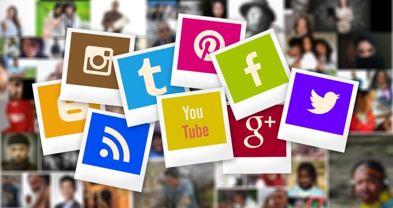
The site should display social media icons as they will look helpful and exciting to prospective customers’ eyes.
These icons show social media status, which everyone is interested to know. It is good if the company has a dedicated page to display icons like Twitter, Facebook, etc.
Conclusion
The tips mentioned will boost the website as it will become more customer friendly. Many prospective customers will visit the website and also recommend it to others. With this, the website will have more customer footfall, increasing the business in the long run.
After taking customer suggestions, add relevant and essential tools, especially if the site is an e-commerce site.
Check the website after adding new details, and also look through the eyes of the visitors, as these might increase sales in the long run.


